Create a Dashboard
Custom dashboards allow you to curate specific datasets into a single, cohesive view. Whether you are monitoring high-level infrastructure health or debugging a specific microservice, dashboards provide the visual context needed to make informed decisions.
Note
Custom dashboard creation is available on all FusionReactor plans.
Before you start
- Permissions — ensure your user profile has the necessary permissions to create and edit dashboards.
- Query knowledge — familiarise yourself with the query language of your target data source (LogQL for logs, PromQL for metrics, or TraceQL for traces).
Steps
Step 1 — Select Dashboards from the navigation menu.
Step 2 — Click New in the top-right corner and select New dashboard.
Step 3 — On the empty dashboard, click + Add visualization.
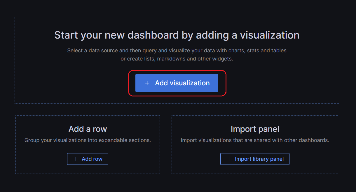
Step 4 — In the dialog box that opens, do one of the following:
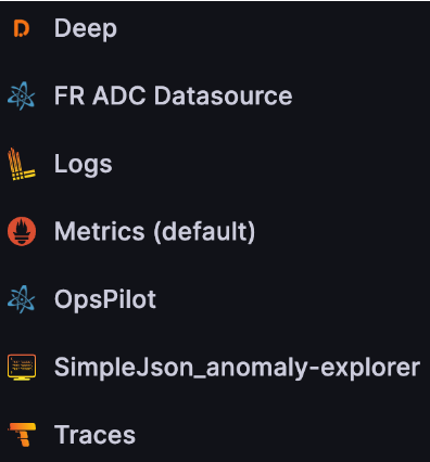
- Select one of your existing data sources.
- Select one of the built-in special data sources.
- Click Configure a new data source to set up a new one (Admins only).
Info
The Edit panel view initially displays your chosen data source. You can modify the panel data source at any time using the drop-down in the Query tab.
Step 5 — Construct a query in the query language of your data source.
Step 6 — Select the Refresh dashboard icon to query the data source.
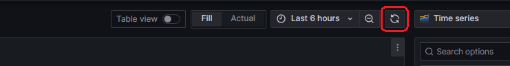
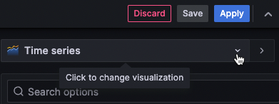
Step 7 — In the visualization list, select a visualization type.
Step 8 — Under Panel options, enter a title and description for your panel.
Step 9 — Adjust panel settings as needed. Refer to the following for options:
- Configure value mappings
- Visualization-specific options
- Override field values
- Configure thresholds
- Configure standard options
Step 10 — Click Save to save the dashboard, or Apply to preview changes first, then save via the dashboard header.
Step 11 — Enter a summary of your dashboard changes.
Step 12 — Enter a title and select a folder.
Info
We recommend saving custom dashboards to the General folder.
Step 13 — Select Save.
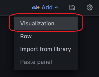
Step 14 — To add more panels, click Add in the dashboard header and select Visualization.
Visualization types
OpsPilot offers a variety of visualizations to support different use cases.
Graphs & charts
| Type | Description |
|---|---|
| Timeseries | Default graph visualization for time-based data. |
| State timeline | For state changes over time. |
| Status history | For periodic state over time. |
| Bar chart | Shows any categorical data. |
| Histogram | Calculates and shows value distribution in a bar chart. |
| Heatmap | Visualizes data in two dimensions, typically for magnitude of a phenomenon. |
| Pie chart | Typically used where proportionality is important. |
| Candlestick | Typically for financial data where the focus is price/data movement. |
Stats & numbers
| Type | Description |
|---|---|
| Stat | Big stat display with optional sparkline. |
| Bar gauge | Horizontal or vertical bar gauge. |
Learn more
See the Grafana visualization docs for the full list of available types.
Need more help?
Contact support in the chat bubble and let us know how we can assist.