Metrics
The Metrics tab provides an historic view of your server's performance and health. Data updates automatically if an auto-refresh interval is set, or manually when a new time range is selected.
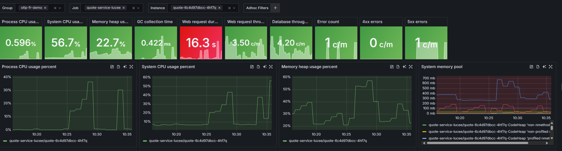
The Stats section displays key performance metrics as a grid of cards across the top of the page. Use the Stat show as dropdown in the filter bar to control which aggregate function is applied to the values shown:
| Option | Description |
|---|---|
| Last | The most recent value recorded in the selected time range |
| First | The first value recorded in the selected time range |
| Min | The lowest value recorded |
| Max | The highest value recorded |
| Mean | The arithmetic average across the time range |
| Median | The middle value when all data points are sorted |
| Mode | The most frequently occurring value |
| Total | The sum of all values across the time range |
Use the Select Group, Select Job, and Select Instance dropdowns alongside Stat show as to filter the stats and graphs to a specific server or service.
| Metric | Description | Why It's Useful |
|---|---|---|
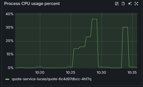
| Process CPU Usage | Percentage of CPU used by this specific process. | Detects CPU-intensive applications or bottlenecks. |
| System CPU Usage | Overall CPU usage across the system. | Helps identify if the host system is under load. |
| Memory Heap Usage | Amount of heap memory currently in use. | Useful for monitoring memory leaks or high memory consumption. |
| GC Collection Time | Time spent performing garbage collection. | High values may indicate inefficient memory management. |
| Web Request Duration | Average time to complete a web request. | Reveals latency or slow response trends. |
| Web Request Throughput | Number of requests handled per minute. | Shows traffic volume and server load. |
| Database Throughput | Number of database operations per minute. | Helps track query load and database responsiveness. |
| Error Count / 4xx / 5xx Errors | Number of failed or client/server-side errors per minute. | Quickly highlights failing transactions or service issues. |
Note
Panels refresh automatically if an auto-refresh interval is set using the top icon. Otherwise, they update when a new time range is selected.
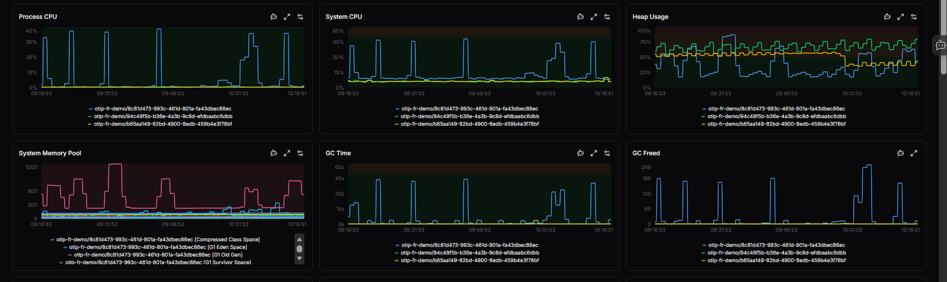
Detailed graphs
Each graph provides historical trends for the metrics shown below.
You can:
- Zoom in or out on a time range to analyze spikes or anomalies.
- Hover over data points to see exact metric values.
- Compare multiple metrics to find correlations (e.g., CPU spikes vs. increased error count).
Graphs include:
- CPU and Memory trends
- Garbage Collection behavior
- Request and error rates
- Database and trace throughput
This helps with root-cause analysis - understanding what led to a performance change or incident.
Metric graph actions
The top-right corner of each metric graph contains three action icons:
-
Ask AI - Send this metric to OpsPilot AI for natural language explanations and analysis of patterns or anomalies.
-
Full screen - Open the metric in full-screen view for detailed analysis and extended time ranges.
-
Edit thresholds - Configure warning and critical thresholds for this metric inline using the toggle. When a metric exceeds a threshold, it is highlighted visually in the stat cards and graphs.
Need more help?
Contact support in the chat bubble and let us know how we can assist.