Services Overview
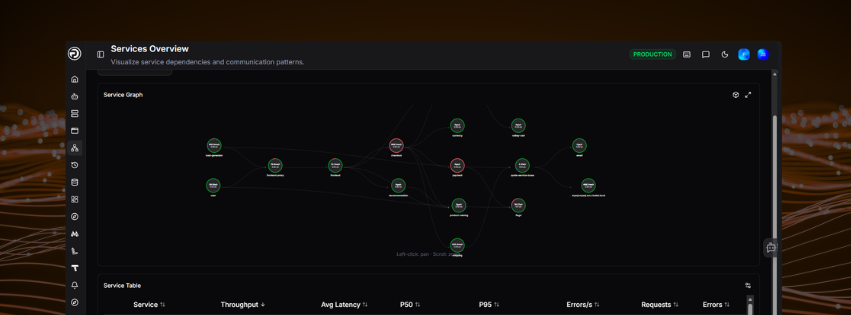
The Services page gives you full visibility into your OpenTelemetry-instrumented services - how they connect, how they perform, and where problems are occurring.
Watch this short walkthrough to see the Services view in action - covering the service graph, dependency mapping, latency and error metrics, and how to drill into individual services for deeper investigation.
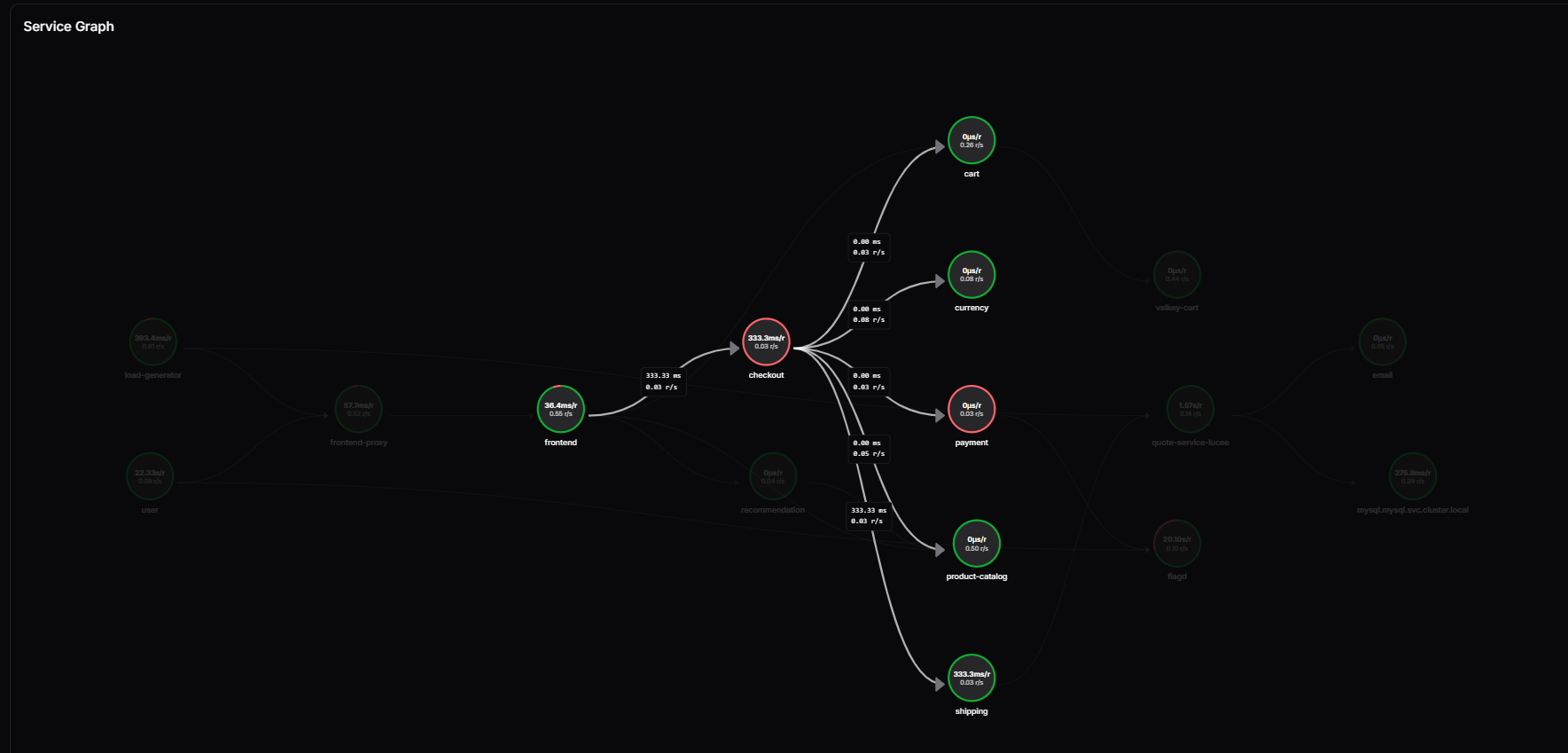
Service Graph
The Service Graph displays your services as an interactive network diagram, showing the communication patterns and dependencies between them. Each node represents a service. Connections between nodes show how services call each other.
Use the graph to quickly identify which services are upstream or downstream of a problem area. You can pan by clicking and dragging, and zoom using the scroll wheel.
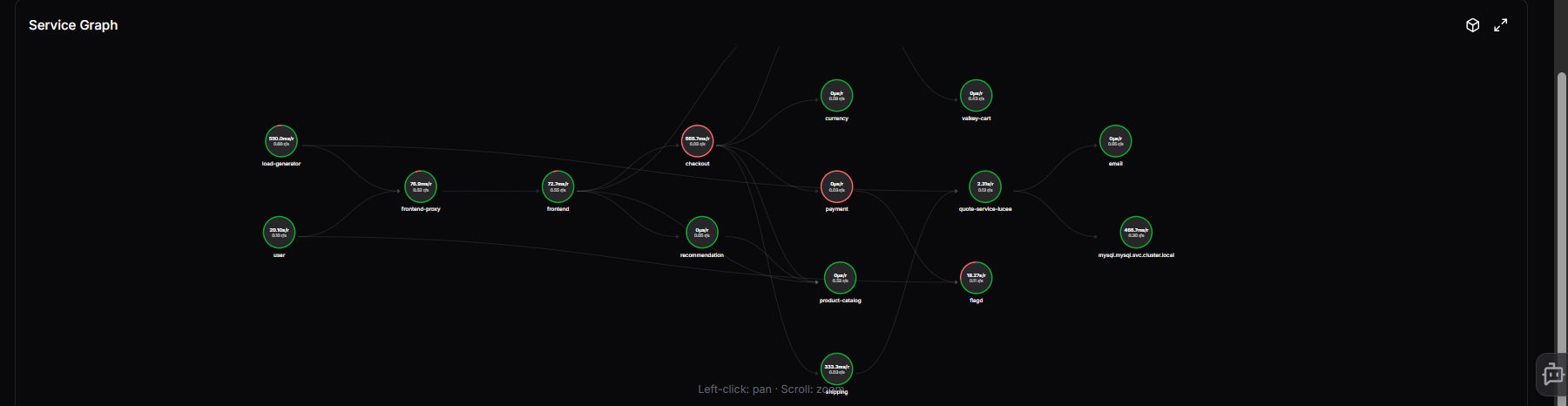
Each node shows the service's average latency and request rate directly on it. A red arc around the node indicates the error rate - the larger the arc, the higher the proportion of erroring requests. Connection lines between nodes show the latency and request rate for that specific call path, and arrows indicate the direction of the call.
Node types
Nodes are visually differentiated by type so you can understand your environment at a glance:
| Type | Description |
|---|---|
| Service | A standard instrumented service |
| Database | A database dependency (shown with a cylinder icon) |
| User | An external user or client entry point |
| Virtual | A virtual node representing a grouped or inferred dependency |
The legend in the top right of the graph shows a count of each node type present. Click a node type in the legend to filter the graph to only that type.
Grouping peers
Similar services can be grouped together using the Group peers by name similarity toggle. When enabled, nodes with similar names are collapsed into a single group node, reducing visual clutter in large environments. Toggle it off to expand all groups and see individual nodes.
Node tooltip
Click any node to open a detailed panel showing:
- Throughput, Avg Latency, Errors/s, and Error Rate for the service
- Inbound connections - the upstream services calling this one, with their latency
- Outbound connections - the downstream services this one calls, with their latency
- Quick links to View service detail, View traces, and View logs
Use the Focus button in the top right of the panel to isolate that service in the graph. Focus mode hides all unrelated nodes, leaving only the selected service and its direct inbound and outbound connections. A Clear focus: [service name] button appears in the top right of the graph panel - click it to return to the full graph.
Graph controls
The icons in the top right corner of the graph panel give you additional viewing options:
-
Layout (hierarchy icon): opens a dropdown to change how nodes are arranged in the graph. Available layouts are:
Layout Description Hierarchy (left-to-right) Columns by topological order; sources on the left (default) Hierarchy (top-to-bottom) Rows by topological order; sources at the top Force-directed Physics simulation; springs along edges, repulsion between nodes Circle All nodes on a single ring Concentric Rings keyed by topological rank - sources at the centre Radial tree Subtrees fan out as angular slices from the root Grid Uniform grid, row-major insertion order
- 3D toggle: switches the graph between a flat 2D layout and a 3D view
- Expand: opens the graph in full screen for a clearer view of complex environments
Use Clear all to reset any active service filters.
Service Table
Below the graph, the Service Table lists all services with key performance metrics:
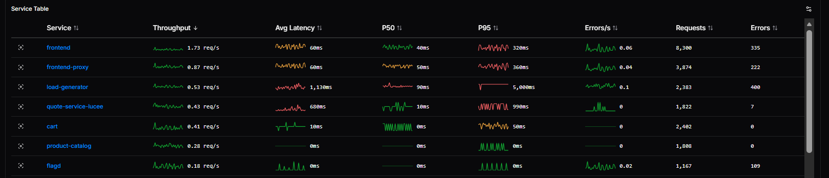
| Column | Description |
|---|---|
| Service | The service name |
| Throughput | Request rate with a sparkline showing recent trend |
| Avg Latency | Average response time across all requests |
| P50 | Median latency |
| P95 | 95th percentile latency |
| Errors/s | Error rate per second |
| Requests | Total request count in the selected time range |
| Errors | Total error count in the selected time range |
Click any service name to open the Service Detail view with that service pre-selected, giving you an immediate breakdown of its performance, errors, logs, and alerts.
Use the Select Service dropdown to filter the graph and table to a specific service. Use the time range selector in the top right to adjust the period shown.
Thresholds
You can configure warning and critical thresholds for key service metrics directly from the Services Overview page.
Click the thresholds icon in the top right of the Service Graph panel to open the Thresholds panel.
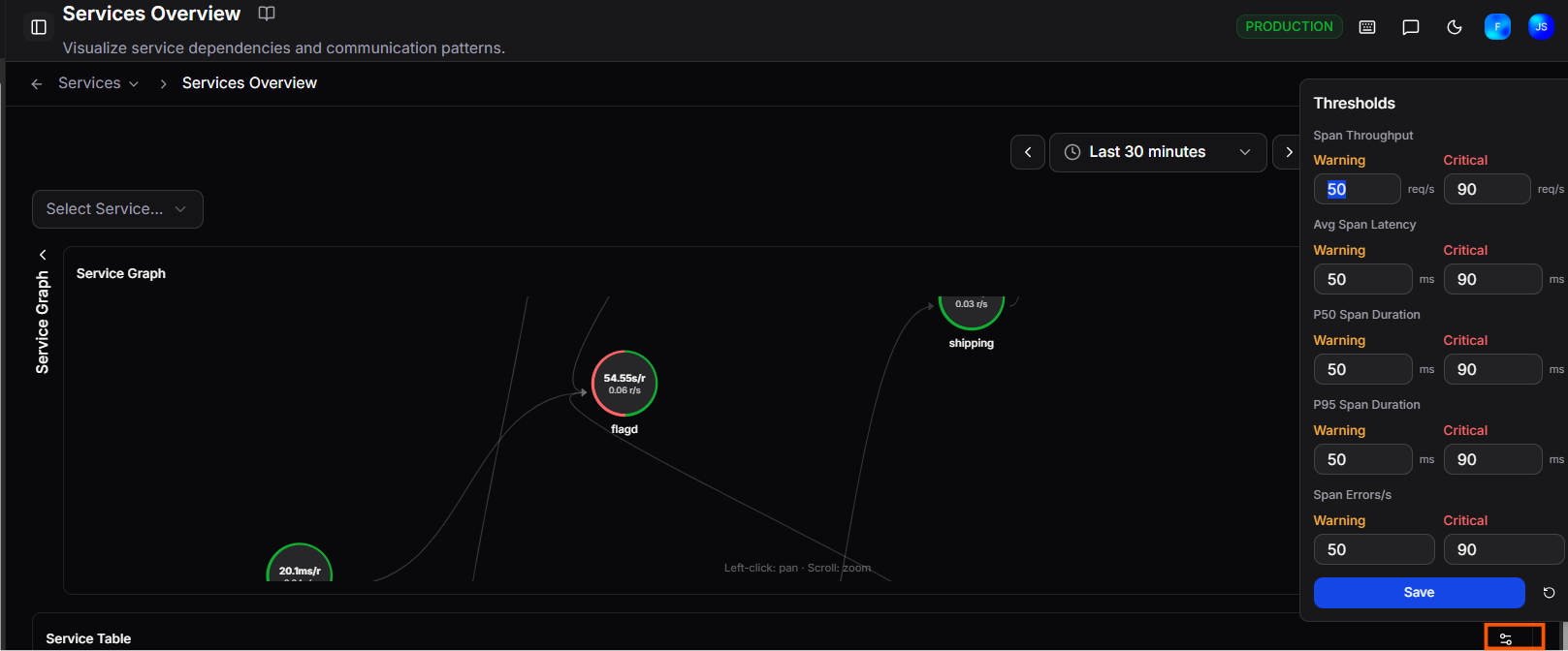 Set Warning and Critical values for each metric:
| Metric | Unit |
|---|---|
| Span Throughput | req/s |
| Avg Span Latency | ms |
| P50 Span Duration | ms |
| P95 Span Duration | ms |
| Span Errors/s | errors/s |
Click Save to apply your changes, or use the reset button to restore all values to their defaults.
Need more help?
Contact support in the chat bubble and let us know how we can assist.